Dec. 1st, 2007 04:00 pm
Banner Tutorial 14 out of 25
^_^ 1st December post... Who still reads these?
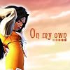
Go from this to this: .
.
CREDIT TO:![[livejournal.com profile]](https://www.dreamwidth.org/img/external/lj-userinfo.gif) devils_sucubus for the icon.
devils_sucubus for the icon.
THIS IS NOT MY ICON. If the creator has a problem with me using their icon, please contact me! :)
So you'll end up with all the following information: (copied from![[livejournal.com profile]](https://www.dreamwidth.org/img/external/lj-community.gif) custom_banners)
custom_banners)
icon:
http://i44.photobucket.com/albums/f1/xoamortentiaox/Tutorials/Tutorial%2024/00.jpg
series/character: dunno... think she's from final fantasy....
placement: Mod's Choice
icontest community: mog_awards
week number: 55
theme: Sky
link to winning post: (.... my laziness)
lj name you want on banner:devils_sucubus
font used: Fairydust
brush credits: n/a
file format: any
Additional comments? none.
THIS TYPE OF BANNER MAKING IS GOOD FOR: Banners you feel like doing a bit of manipping.... -_-' I dont suggest using it that often unless you have too.
Go from this to this:
 .
.CREDIT TO:
THIS IS NOT MY ICON. If the creator has a problem with me using their icon, please contact me! :)
So you'll end up with all the following information: (copied from
icon:
http://i44.photobucket.com/albums/f1/xoamortentiaox/Tutorials/Tutorial%2024/00.jpg
series/character: dunno... think she's from final fantasy....
placement: Mod's Choice
icontest community: mog_awards
week number: 55
theme: Sky
link to winning post: (.... my laziness)
lj name you want on banner:
font used: Fairydust
brush credits: n/a
file format: any
Additional comments? none.
 |
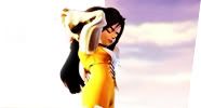
We start them all off with the icon copy and pasted to a 300x100 canvas. ^^ Align this one to the right so we can make the sky the background for the icon. |
 |
I found this image (the original image wasn't cut up). I used the sky and maniped the background. |
 |
Then I used Image>Ajustments>Variations to color the background an orangish color. (use Midtones and click the respective colors until they look right.) |
 |
Next duplicate the icon. Horizontally flip the dulicated icon and align it to the right side of your original icon. Use a blurred circle eraser in order to lightly erase the part with teh character on it. It allows for blending between icon and banner. |
 |
Now use that picture that we had back up in part 2 and align the girl on the right side. Use only the part that "didnt appear" in the icon. Under that picture's layer, make a white border around the girl like they did in the original icon. |
|
Add text and you're done! |
THIS TYPE OF BANNER MAKING IS GOOD FOR: Banners you feel like doing a bit of manipping.... -_-' I dont suggest using it that often unless you have too.
no subject
That's a creative way to finish an icon~
This kind really kills *used to doing it* xD
no subject
^^ YAY! I'm glad you read these still. It gives me more reason to post them. XD
[*laugh* I tried doing this one on a whim... this is the result of my brain running out of ideas]
no subject
I used a sky texture and applied the variations and blurred eraser steps and it turned out pretty good. The extension of the wall or whatever it is in the icon I used a kind of wood texture and then applied the angled strokes filter, and used the line tool for the top part, but I couldn't quite get it to match the way the sky does. The main problem is I can't continue that object in the bottom left of the icon. I think this would be a better opportunity to just try to search for the image on google to solve that, but I wanted to try manipulating textures. Anyway I ended up just using a lazy solution of a drop shadow because it didn't match exactly.
without drop shadow
I'm wondering what your solution to that whole bottom corner would have been :)
no subject
However, as to my solution to the bottom corner. I would have added a small amount of red [color copied from the original icon] and placed it on screen about 50% [just so it's barely noticeable in the background. On top of that layer I would have croped that part of the roof under the tiny text next to sesshoumaru [sp?] and horizontally flipped it. Then I would use a blurred circle eraser in order to erase around the edges so it would match. For the top of the roof.... I would crop the area above the tiny text and flip it until it matches the direction of the roof. [of course this layer is under the tiny text]. Then I would blur the edges again with the eraser. ;D
With any luck I came out to something like:
no subject
I've always been a kind of texture banner person because they're easier to pull off most of the time rather that having to figure out exactly how they made the icon; but it's fun when you are able to match them, it's more of a challenge than iconning itself XD
no subject
Texture banners are easier to pull off, but when you get good enough at it it's really simple to figure out ways of making a banner look exactly like the icon. XD but it's fun when you are able to match them, it's more of a challenge than iconning itself XD YES! I totally agree there! [and sometimes people don't realize that until they do it. XD]