Aug. 11th, 2007 10:05 pm
Icontest Banner Tutorial 9 of 25
ergs. sorry about my recent lack of updates. lots of stuff going on right now... like summer reading [yeah i procrastinated] and stuff like that. XD
From this point on, i'm no longer bolding certain words [because in my case, they end up being the whole tutorial]. i'm only bolding tips now.
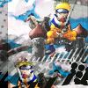
Go from this to this: .
.
CREDIT TO:![[livejournal.com profile]](https://www.dreamwidth.org/img/external/lj-userinfo.gif) faintscribbles for the icon.
faintscribbles for the icon.
THIS IS NOT MY ICON. If the creator has a problem with me using their icon, please contact me! :)
So you'll end up with all the following information: (copied from![[livejournal.com profile]](https://www.dreamwidth.org/img/external/lj-community.gif) custom_banners)
custom_banners)
icon:![]()
series/character: Naruto//Naruto
placement: Best Cropping
icontest community: anime_medley
week number: 129
theme: Repeated
link to winning post: i'm to lazy to look. xD sorry.
lj name you want on banner:faintscribbles
font used: n/a
brush credits: not given
file format: .jpg
Additional comments? n/a
THIS TYPE OF BANNER MAKING IS GOOD FOR: It's good only if you have time and have no idea how to make a certain banner work. It's also good if you are asked to make a brushed banner or if you don't have the original image handy.
From this point on, i'm no longer bolding certain words [because in my case, they end up being the whole tutorial]. i'm only bolding tips now.
Go from this to this:
 .
.CREDIT TO:
THIS IS NOT MY ICON. If the creator has a problem with me using their icon, please contact me! :)
So you'll end up with all the following information: (copied from
icon:
series/character: Naruto//Naruto
placement: Best Cropping
icontest community: anime_medley
week number: 129
theme: Repeated
link to winning post: i'm to lazy to look. xD sorry.
lj name you want on banner:
font used: n/a
brush credits: not given
file format: .jpg
Additional comments? n/a
 |
Place icon on a 300x100 canvas aligned right. |
 |
So now what i did to get the cloud texture is I searched "cartoon clouds" on google and used one of the textures from there. I filled the 200x300 space between the icon with this texture. |
 |
I duplicated the layer and set it to overlay. This makes it lighter and brighter, creating the right coloring you need for the background of the icon. |
 |
Now if you look at the bottom right of the icon, you'll notice black dots. It's common to find little things on the icon and make them part of the banner. I used this brush and filled in the bottom left corner of the banner. |
 |
Using a similar technique above. I noticed the slanted lines, then i used this line brush on #FFFFFF. |
 |
If you look super close the clouds on the icon have a pinkish tint. You can achieve this two ways, either you can soft brush the pink on, or use the nice lazy meathod of applying a single "frilly" brush and setting it to Darken. Darken will usually only darken light colors like white, but it wont darken super bright colors like the blue. For this I used this brush on #F2DFEC. |
 |
Now I made a box along the left side of the banner. This allows a marker as to where the banner ends and also matches the one in the icon. I used #C4C2C2 and set it to Normal 68%. |
 |
Just to add a nice touch, do not deselect the area you have created in the step above. Instead, use the brush found in step 4 and make blackish dots only on the thick grey line you created in the step above. |
 |
Do the same thing as step 6 but on the right side of the banner. |
 |
Do the same thing as step 7 but on the right side of the banner (make sure you use different dots though). |
|
Just add text (for this I used Garamond and Dyspepsia). YOURE DONE! |
THIS TYPE OF BANNER MAKING IS GOOD FOR: It's good only if you have time and have no idea how to make a certain banner work. It's also good if you are asked to make a brushed banner or if you don't have the original image handy.
no subject
The font is nice,sometimes it's hard to decide what font to use on hush icons.
no subject
omg i know what you mean! i'm pretty good at matching the banner to the icon, but when it comes to text i'm like @)%@)#%@#%. XD sometimes i wish i could just ask if i could just make the background and someone else put on the text. XD